Not exactly a piece of cake
Since 1995, Pièce Montée have been building exhibitions, museum galleries and TV sets that leave you standing there with your mouth open. For their own website they designed a homepage that is, quite literally, a pièce montée. We made sure the cake doesn’t collapse on any screen.
Visit piecemontee.be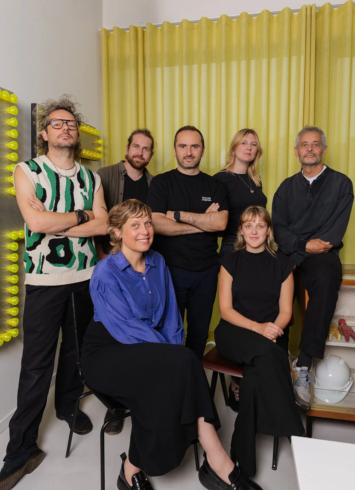
If you walked into a museum in Flanders over the past thirty years, chances are you walked through the work of Pièce Montée. Ontheemd and For Evermore at the In Flanders Fields Museum. Van Eyck. An Optical Revolution at MSK Ghent, with the restored panels of the Ghent Altarpiece. Sabena at the Atomium. Exhibitions for the Van Gogh Museum in Amsterdam. And if you ever watched Blokken or Idool on Flemish TV, you’ve already stared at one of their sets.
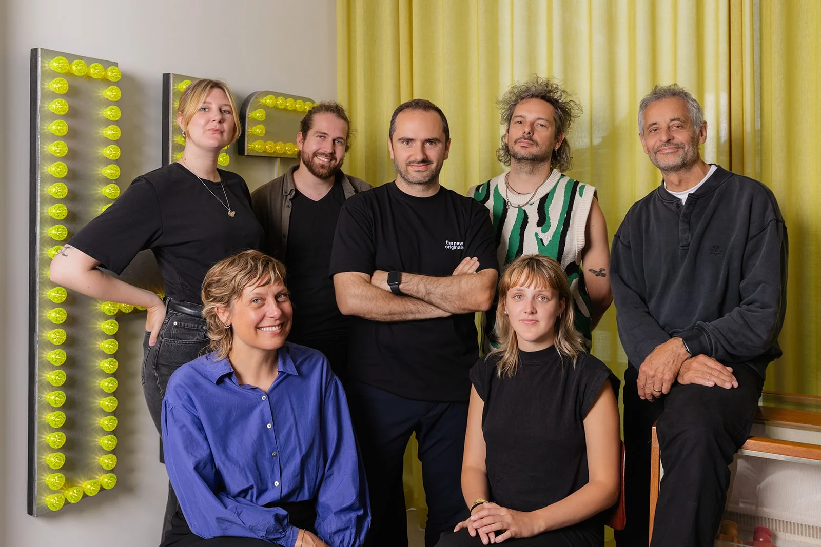
Rik Jacques started it in 1995. Today the studio in Ghent works as an open house: the right people around the table for every project, seasoned scenographers next to young talent, concept, design and production in the same hands. It shows. Their exhibitions tell a story before you’ve read the first label.
Our kind of people
At the top of their website sits a little heart, followed by a rotating line of words. Scenography, history, television, science, architecture. And in between, without blinking: fries and coffee. That’s all you need to know about a studio to want to work with them.
A homepage you want to bite into
Pièce Montée designed the site themselves, and the design had character. At the top, projects are stacked like an actual pièce montée: one tile, then three, then five. Below that, the work continues in five columns. No photos in the grid, just titles and clients. The image only appears when you hover over a tile.
Lovely on paper. We got to bake it.

Stacking is maths
A cake looks simple until you have to build one. Below the pyramid sit more than ninety projects in five columns, and those columns have to line up row by row. No gaps, no tile sticking out. The trick: every tile is either small or tall, and a tall tile is exactly two small ones plus the gap. That way every row closes, no matter how many projects get added.
When the studio adds a project in the CMS, everything else shifts along. Nobody has to sit there puzzling with tiles. Except us, once, thoroughly.

Looking without clicking
Hover over a tile and the project appears, in a photo with rounded corners that fits the tile exactly. The rest of the page stays calm. At the bottom you filter by exhibition, permanent display, television, education or interior. On a phone the pyramid stacks into a single column: same tiles, same order, just served in slices.

A different flavour every time
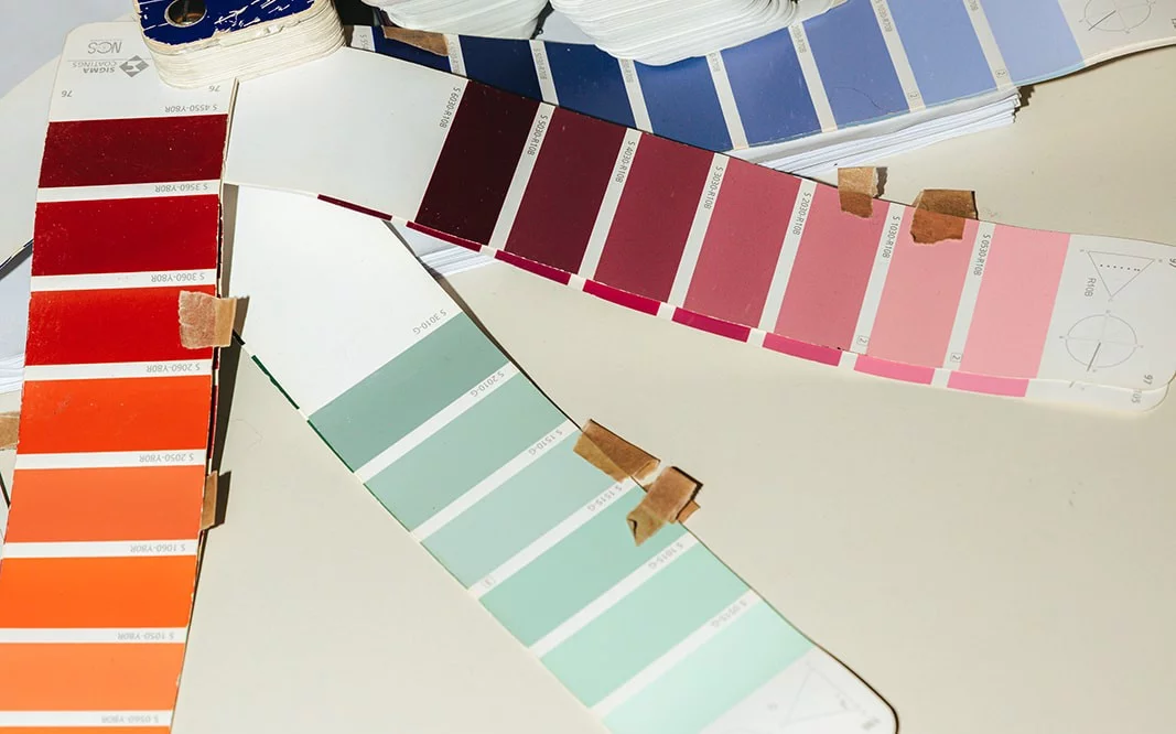
A scenographer doesn’t pick a colour, they pick a palette. So does the site. Every visit gets one of six: light blue, salmon, lemon, lilac, mint or off-white. Background and tiles change along. Come back twice and you won’t get the same pastry twice.

Letting the work shine
Behind every tile is a project page: title, client, place and year, the roles as labels, a text box in the colour of the day and a grid of large photos. At the bottom you’ll find similar projects, so you can wander from the Ghent Altarpiece straight into the next museum.
Everything in Dutch and English, and the studio manages all of it in Kirby. We built the set, they put the pieces on stage.

Better together
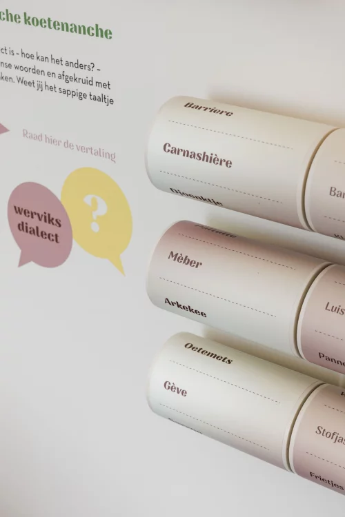
It clicked beyond their own website too. In the National Tobacco Museum we built the web app behind the QR codes of the tourist welcome centre in Wervik. Together with Pièce Montée and Little Harry we made the cycling app Expedition Testerep for the Belgian coast, across an island that no longer exists. And over the years we helped build applications for the In Flanders Fields Museum, BELvue, the Halle Gate, the Red Star Line Museum, the Plantin-Moretus Museum, Amsab, Bokrijk and the Van Gogh Museum, among others.
They dream up worlds you want to walk around in. We make sure the tech stays politely behind the set. Division of labour as it should be.

One beef stew, five languages
Website & menu →