One beef stew, five languages
Brasserie 't Vosken has been sitting on Sint-Baafsplein in Ghent since 1908, with the cathedral for a neighbour and the terrace for a signboard. We designed and built the website, and drew the printed menu while we were at it. The heart of the site is that menu: 88 dishes in five languages, with the fourteen European allergens colour-coded on every single one. The restaurant fills in one row; the site does the rest.
Visit tvosken.be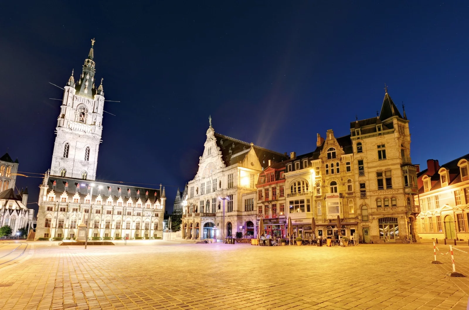
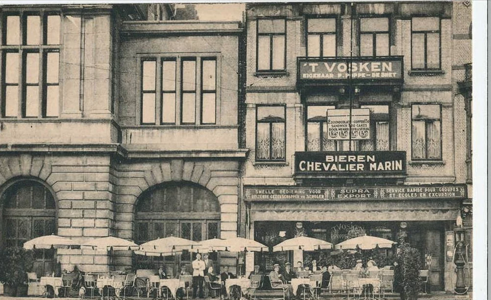
't Vosken has stood on Sint-Baafsplein since 1908: a hotel first, a brasserie after. Alain Schwartz and Christine Geirnaert have been running it since 1988. The menu holds what you'd hope for — beef stew in beer, waterzooi, rabbit the way grandmothers made it — and the terrace sits in the middle of the square, between the cathedral, the belfry and the city theatre.
A place where locals and tourists share a table needs a website that can handle both. We designed and built one. And since a brasserie also needs something to put on the table, we drew the printed menu to go with it.
One row, five names
The menu isn't a PDF or a long page of text. It's a list in the CMS: twelve categories, from sandwiches to desserts, 88 dishes in total. Every dish is a single row, and that row holds the name in Dutch, French, English, German and Spanish side by side, plus the price, a Season toggle and the allergens.
When the price of the beef stew changes, it changes in one place. Not five times, in five language versions, with one of them quietly staying behind. And if a sixth language ever turns up, the extra name field appears in the same row by itself.
Open a translation in the panel and the menu isn't there. A notice is: the menu is managed in Dutch. Without it, someone would start typing in the French version, and you'd end up with two menus slowly drifting apart. A dish that hasn't been translated yet shows up in Dutch. Better a name you have to guess at than an empty line.


Fourteen dots, thirteen in use
Next to every dish sits a row of coloured dots: the fourteen allergens from European regulation 1169/2011. Each one has its own colour, its own icon and a name in all five languages. The restaurant ticks what's in the dish, and that's the whole job.
At the bottom of each category there's a legend listing only the allergens that actually appear on that page. Ten on the specialities, seven on the fish. Not a wall of fourteen icons where half of them don't apply. Below it stays the sober line that recipes can change and that you're welcome to ask — a line the restaurant edits itself.
Thirteen of the fourteen are ticked somewhere. Soy turns up in nothing at all. That's information too.


Same menu, other language
Put the Dutch and English fish pages side by side and there's remarkably little between them: same order, same prices, same dots. Only the names change, and Tomaal garnaal — the one dish set to Seizoen — introduces itself in English as Tomato shrimp, Seasonal.
Moving to this model carried 372 dish names across and emptied 48 dead language copies of the menu. In September 2026 the Spanish version got the correct language code — es instead of sp — with a redirect for anyone still holding an old link. A visitor sees none of it, which is exactly the point. Multilingual is rarely a trick, by the way: at Tranzistor it was Greek next to English, in an alphabet half the visitors can't read.

And then on the table
The printed menu is a three-panel fold with the fox on the cover and the same structure as the website: categories, prices, coloured dots and a legend at the bottom, there with the names in Dutch and English. That print came first: it dates from September 2025, the dots on the site followed a year later. The screen copied the paper, not the other way round.
Paper and screen share more than their colours, by the way: the menu on the table comes from the same data as the menu on the screen. We keep a little helper of our own at the office for that. Change a price and the print keeps up, with nobody retyping columns.
And the printed menu carries a QR code in the same style as the rest: scan it at the table and you're on the site, where the latest version is always waiting.

Table free?
Bookings go through the contact form, where a toggle marked I'd like to book asks for the date, the time and the number of people. The mail lands at the restaurant with the guest as the reply address, so confirming takes one click. For a table within 24 hours they ask you to call: with a full house, a phone still beats an inbox.
In September 2026 the site moved to Kirby 5, with a proper clear-out: old scripts replaced, unused code removed, settings tightened. We also corrected this very project page, which had been claiming since last year that the site speaks four languages. It speaks five. The cobbler has had a look at his own shoes.
Related work
Other work that connects to this.


Mapping success (part 2)
Web app →