
Drawn to scale
FM Studio is the practice of architect Francesca De Fonseca and interior architect Margaux Lisabeth. Thirty projects, three categories, not a word too many. We drew and built them a portfolio in which every measurement is one twelfth of the screen, and which they extend themselves.
Visit fm-studio.be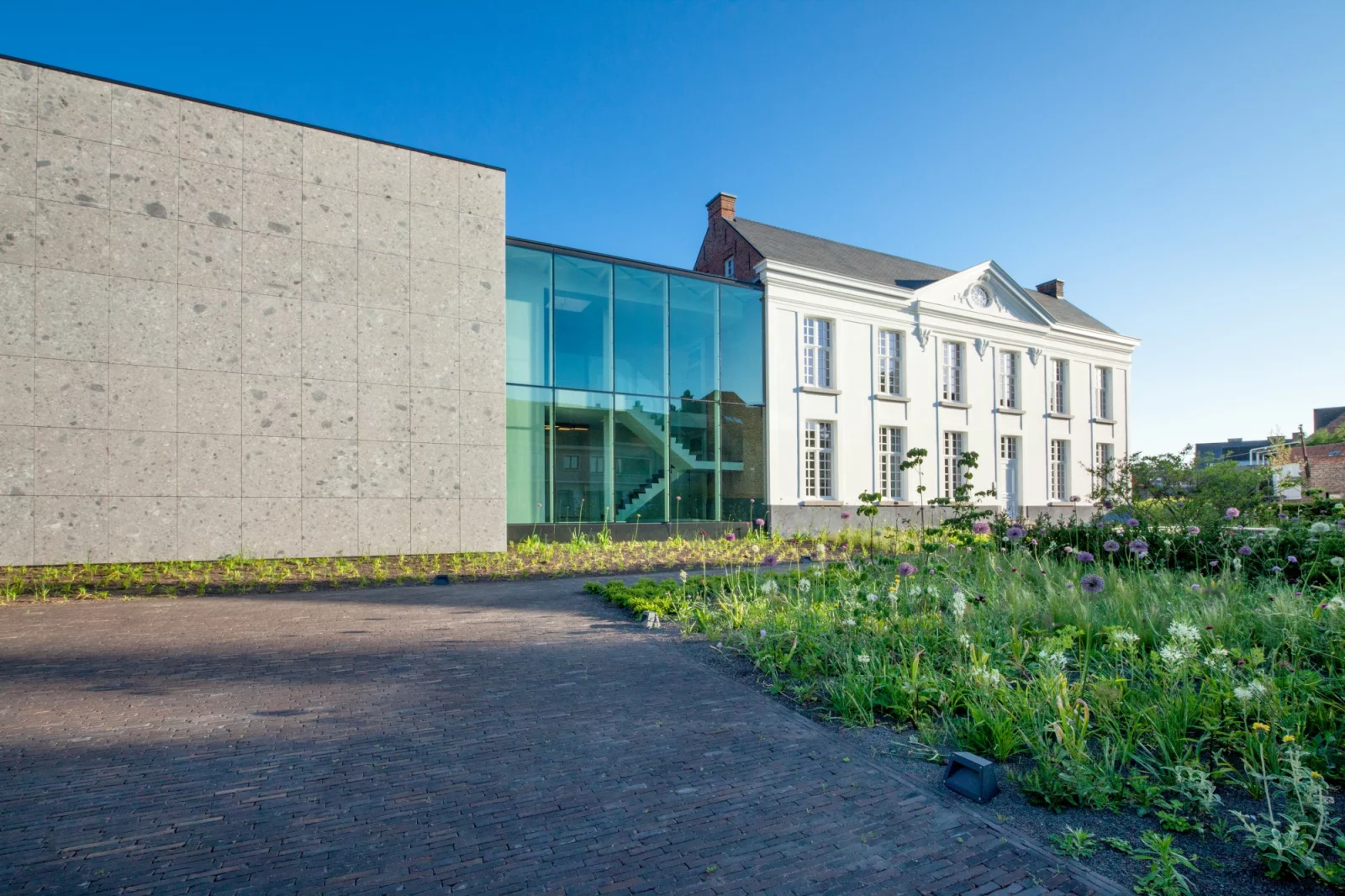
FM Studio works from Kievitlaan in Ghent: Francesca De Fonseca, architect, and Margaux Lisabeth, interior architect. Between them more than forty years of experience, from houses to offices, from foundations to furnishings. Their projects don’t get poetic names, they get file numbers: G01, G06, G52, T.SOPHARMA.
The brief for their website was just as businesslike: the work had to be visible, they had to be able to add projects themselves, and everything else could go. Design and build were ours. No mission statement, no slider full of slogans, no news section that dies after three months.

One measurement, twelve times
A drawing starts with a grid of axes, and so does this site. We put one measurement underneath it — one twelfth of the screen width — and drew everything else on top. Every field, every margin, every photo is a multiple of it. That measurement appears ninety-seven times in the compiled CSS, which means the blocks on the page aren’t sized in pixels but in twelfths.
The result scales like a drawing you blow up: on a wide screen everything grows in the same proportion instead of just spreading out. If you think in pixels, brace yourself. If you draw plans, you’ll nod.

The grid counts to four
A category page shows images and nothing else. No titles, no years, no filters. The grid uses two widths, four units and five, in a fixed order: small, large, large, small, and round again. Every row mirrors the one above it while the left and right edges stay exactly where they are.
Thirty projects hang there today: thirteen in Architecture, thirteen in Interior, four in Landscape. Some appear in more than one category, because a building with a garden and an interior is simply the same building three times.

One landscape or two portraits
A project page is a gallery, and that gallery is a list of rows. For each row the studio picks one of two options: a single landscape image, or two portraits side by side. There is no third option, and that is the point. Landscape measures ten units, portrait four and a half, with one unit in between. Everything is five units tall. Whatever you choose, the row closes.
No column picker, no draggable blocks, no chance of breaking the grid between two site visits. Freedom is nice; a gallery that always lines up is nicer.

Thirty case files
Every project page is built the same way: the title, a banner across the full width, a portrait image beside a coloured text block that slides two units up over the banner, and the gallery below. Two round arrows walk you through the category, project by project.
The colour of that text block belongs to the category, not to the page. Give Interior a different colour tomorrow and every interior project follows. If the colour is too dark for black type, one switch turns the text light.

Adding a wing themselves
In the back end a project looks like a case file: grid image, banner, intro, image next to text, and the gallery as a table where every row picks its own type. Beside it sits that page’s image library. The category carries a colour picker and that switch for light text. There is an SEO tab, and in the site settings FM Studio manages the menu, the footer and the cookie notice themselves.
Everything you see on the site, they can change without us. We only have to show up when something new needs building. With a portfolio that rarely happens, which is a compliment to the grid.

Replacing the foundations without moving out
From 2024 the site ran on Kirby 3. In August 2026 we lifted it to Kirby 5 in stages: keys moved out of the code into a separate file that stays out of the repository, the leftovers of features this site never used — a login, a payment module, a news module, a search module — taken out, and the existing content converted to the new format by script. PHP 8.2 or higher, code in git, content and images deliberately not.
For visitors, nothing changed. For a renovation, there is no better compliment.
Coincidence or not: we like building for people who work with measurements. For scenography studio Pièce Montée we stacked a homepage like a cake, for Footnote Gallery a site where the work takes the lead and the rest is a footnote, and for garden architects Livingreen a tree counter. If you have a grid in your head, we’ll happily do the arithmetic.
Related work
Other work that connects to this.


Rooted in nature, blossoming online
Website →
