Gut feeling, now colour-coded
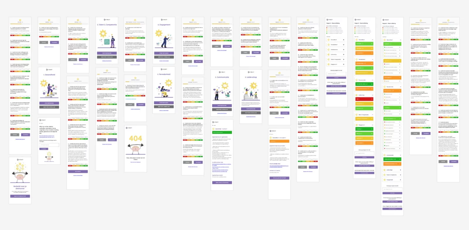
Tryangle and mtech+ wanted to know how workplace wellbeing is actually doing inside an organisation. We built the questionnaire: 61 statements, each with five coloured blocks running from red to green, and a report that tells you where you stand. Anonymous, and in use since June 2023.
Visit mentaalkrachtig.mtechplus.be
Tryangle helps organisations work on wellbeing and happiness at work. mtech+ is the career fund of the Belgian metal and technology sector. Together they wanted to drag the subject out of gut-feeling territory: not a vague sense that something is off, but black on white where it rubs and where it doesn’t.
Altruïs did the design, we built the tool. The first real participant started on 19 June 2023. It has been running ever since.

No account, just a code
You don’t sign up for anything. You press start and the tool hands you a code. Then it asks three things: your postcode, how big your organisation is (from 1 to 9 employees up to more than 250) and which department or group you’re answering for. That name becomes the title of your report. Want to look at the factory floor separately from the offices? Fill it in twice.
Nothing else is asked. No name, no company, no email address — unless you decide at the end that you want your report sent to you.
Six themes, sixty-one statements
Health, satisfaction, communication, leadership, talent & competence, engagement. Each theme breaks down into sub-themes — resilience, ergonomics, pay policy, information flow, role clarity — and the statements hang underneath those. Sixteen sub-themes, sixty-one statements. Terms of employment alone accounts for ten of them.

Red, orange, green
Every statement comes with five blocks side by side, running from red to green, each with its own wording. For physical health policy the row runs from no policy through written down but never communicated to policy actually put into practice. You click the block that fits. Click it again and your answer is cleared.
Three of the sixty-one statements flip the scale, because in those cases “a lot” is precisely the problem. And every click goes straight into the database. No save button, no pop-up asking whether you’re sure.

Taking a break is allowed
Sixty-one statements is not something you squeeze in between two meetings. Hence “save and continue later”: you get a personal link, copy it or have it mailed to yourself, and pick up where you left off. For a questionnaire about wellbeing at work, that felt like the bare minimum.

The report
At the end, every sub-theme gets an average and a colour. Below 2 those are weaknesses, up to 3 pitfalls, up to 3.6 room to grow, up to 4.3 qualities, above that strengths. Themes fold open and shut, so one glance tells you where the red is.

Behind every statement sits a “more info” panel: concrete tips and resources, the mtech+ offer of training courses and webinars, and links to outside sources. All of that content — questions, labels, tips, offer — is managed by mtech+ themselves in the CMS. We never typed a single question into it.

The report link can be shared with colleagues, or reopened a year later to see whether anything moved. Leave an email address and the link gets sent to you, with optional tick boxes to let mtech+ get in touch about training or project funding. Tick nothing and nobody contacts you.
What the counter says
State of play, early September 2026: started 493 times, 7,487 answers clicked, 152 final reports opened. The first code dates from 19 June 2023. The gap between 493 and 152 says something too: sixty-one statements are not idle clicking — which is exactly why that “continue later” link isn’t a luxury.
Three years on
The questions and the advice live as plain files in Kirby, the answers in a database. Few moving parts, so little that can break. In September 2026 we swapped the engine out again: Kirby 5.5.3 on PHP 8.4. Participants noticed nothing, which was rather the point.
One more thing
For three years this page claimed we were still busy building the thing and would let you know the moment it launched.
Consider yourself told.
Related work
Other work that connects to this.

Seven kinds of fifteen minutes
Appointment system →