De Boomhut Primary School
For De Boomhut, a primary school on Boomstraat in Ghent, we built a website parents actually use: as warm as the school itself, with the calendar, the monthly menu and each month’s look back in one place — and readable in every family’s language.
Visit deboomhutgent.be
De Boomhut is a primary school on Boomstraat in Ghent, from the toddler class all the way to sixth grade. A true neighbourhood school, with a spacious playground, a willow hut, a climbing wall and a team that shows up for the children every single day. What it still lacked was a website that carries that feeling — and tells parents what they need to know, fast.
Because a school website isn’t a brochure. Parents come back with very concrete questions: is there school on Wednesday? What are the children eating this month? How do I enrol my child? Who teaches third grade? The site had to answer those in a few taps, on a phone, at the school gate.
Built with the school, not just for it
This project had a very special driving force: Ann, a teacher at De Boomhut — and, as it happens, the wife of our very own Yann. She is in the exact place where those questions get asked every day, so she knew precisely what parents look for and what the team needs.
That short line made all the difference. Everything we built could be tested against daily reality straight away: would a parent visiting for the first time find this? Does a teacher actually get something out of it? The result doesn’t feel like a site about De Boomhut, but a site of De Boomhut.
A tree house worth climbing
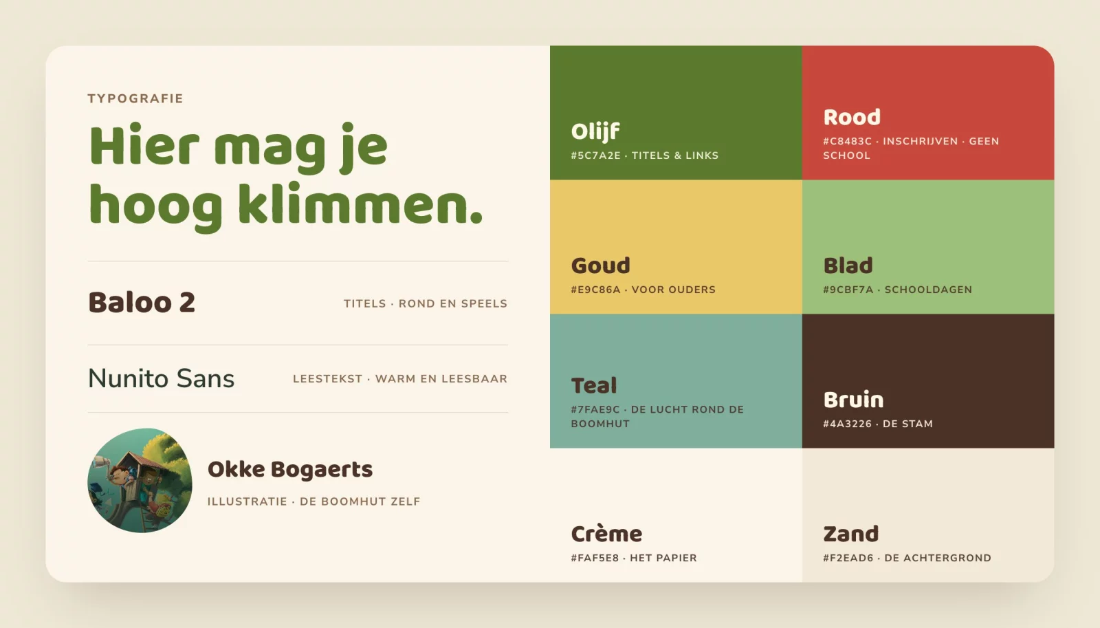
The heart of the visual identity is the illustration by Okke Bogaerts: a tree house full of children exploring the world through a telescope, sliding down a branch or just clambering up the ladder. That drawing set the tone for everything else. The palette follows it seamlessly — olive, leaf green, teal, a warm brown for the trunk and cream for the paper — with red for the button that matters and gold for everything parents need to know.
Headings are set in Baloo 2, a round, sturdy typeface as playful as the drawing; body text in Nunito Sans, warm and easy to read. Cards get soft corners, and beneath the hero the edge rolls like a hill. Childlike, without ever becoming childish.
Everything a parent looks for, every day
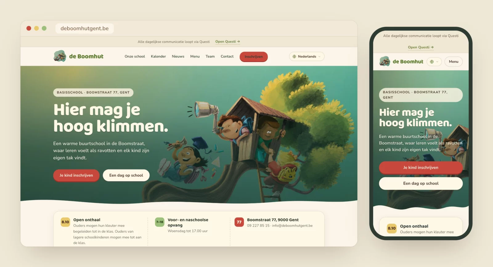
Every page opens with one slim bar: all day-to-day communication runs through Questi, the school’s app. The site doesn’t try to take over that role; it sends parents there in a single click. That way it’s immediately clear what belongs where.
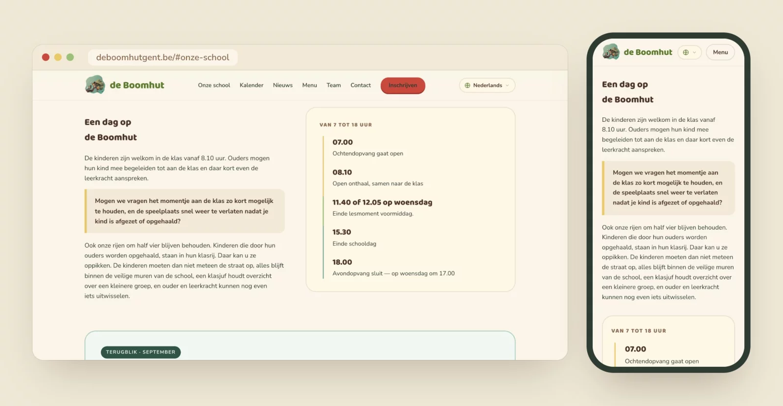
Below it sits the practical core: classrooms open at 8.10, childcare from 7 am to 6 pm, the address and phone number — in three small blocks, before you even need to scroll. Further down, the homepage shows what makes De Boomhut special and how a school day unfolds, hour by hour, from morning care until after-school care closes.
The monthly menu and the month in review
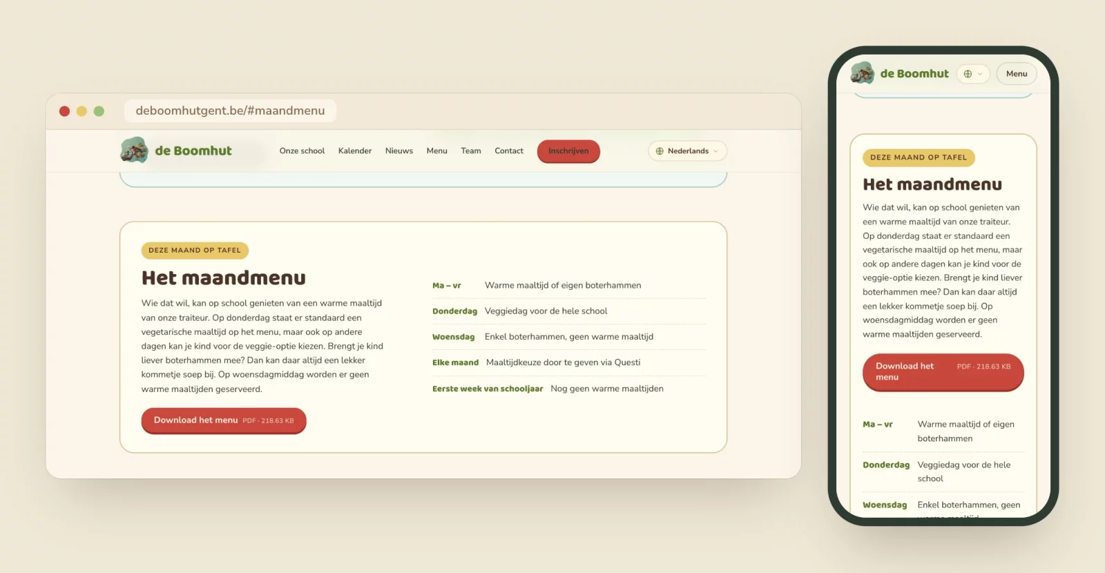
What are the children eating this month? The answer is right there on the homepage: the monthly menu as a PDF, with the fixed arrangements neatly alongside — veggie day on Thursday, no hot meals on Wednesday, meal choices passed on through Questi.
Every month also gets a look back: a page with stories and snapshots of sports day, the first day of school or the school party. The homepage always shows a preview of the current month, and the archive lets you browse back through the whole school year. News and the next dates from the calendar sit just below.
A calendar that keeps pace with the school year
The school calendar lists every date of the school year, month by month. A coloured edge tells you at a glance what it’s about: green for what happens at school, red for days without school, gold for parent–teacher meetings and the parents’ council.
And the calendar tidies up after itself. Whatever has passed moves automatically into a collapsed “Already past” list, most recent first. So the next appointment is always at the top, without anyone lifting a finger.

In every parent’s language
Ghent is a city of many languages, and you notice it at the school gate. A parent who doesn’t read Dutch yet should still be able to check when the autumn break starts or how enrolment works. That’s why every page can be translated into 28 other languages: from French, English and German to Arabic, Turkish, Somali, Bulgarian, Romanian, Polish, Ukrainian, Persian, Pashto and Tigrinya.
The translation itself is automatic, but the language picker is our own work, in the school’s style. Each language is listed in its own script, so parents recognise it without having to read Dutch first. Arabic reads neatly from right to left, and the list honestly notes that Dutch remains the official version.

Enrolment without the headaches
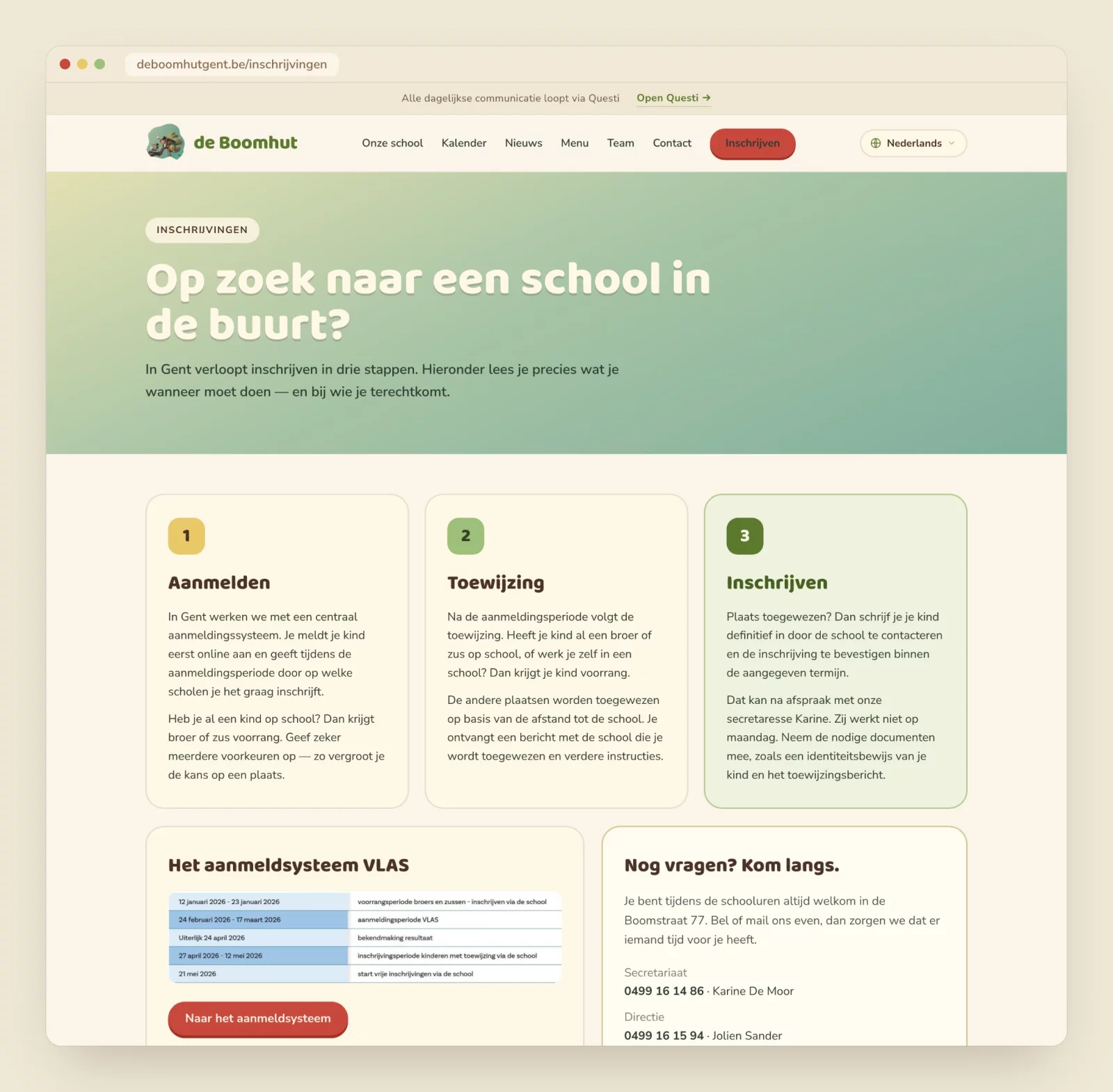
Enrolling a child in a Ghent primary school goes through a central registration system, and that raises plenty of questions for new parents. The enrolment page explains it in three clear steps — register, allocation, enrol — with a link to the registration system and the right contact people alongside. It’s no coincidence that “Je kind inschrijven” — enrol your child — is the first button on the homepage.
And the rest of the school
The team is introduced group by group — management, office, nursery, primary, the family liaison and all the other indispensable people, from the kitchen to the book master — with a photo, or a circle with initials until there is one. The parents’ committee, De Boomhutters, gets its own page inviting parents to lend a hand, whether they have a lot of time or just a little. The school rules are ready to download, and the contact page closes with a quote that suits this school: you don’t judge a fish by how well it can climb a tree.
The result
A website that feels like the school itself: warm, playful and clear. Barely online, and it’s already in full use — by parents looking up the menu, checking the calendar or visiting for the very first time, and by a team that finally has a home for its news and monthly look-backs.
For us, this project had something extra. It’s not every day you build a website for the school where someone from your own family walks in every morning. Thank you, Ann, for the drive — and thank you to the whole De Boomhut team for their trust. Here, you really do get to climb high.
Mattias Desmet
Website, shop & invoicing →