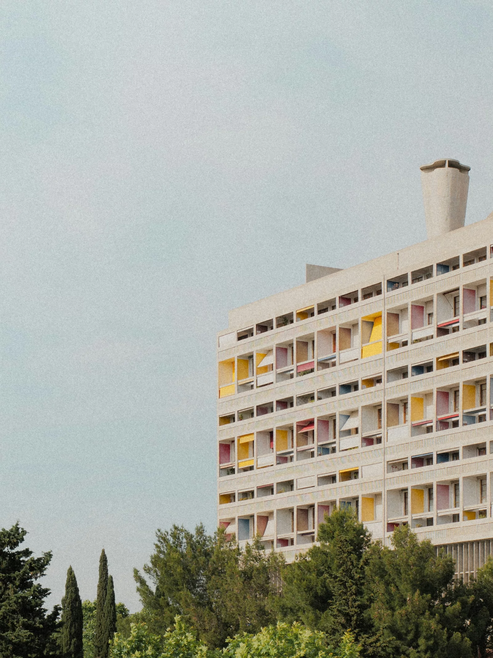
Ground Control · φ 1.618
Grounded in proportion
Every choice rests on proportions that feel right because they aren't fabricated — borrowed from Le Corbusier's Modulor. Two series, one rhythm.
Why proportion
A building and a website share one problem: everything has to start somewhere and end somewhere, and all those measurements have to relate to one another. Decide that element by element and you get a collection. Take it from a single system and you get a whole.
Le Corbusier developed the Modulor during the 1940s, and published it in 1948, to solve exactly that — a system of proportions on a human scale, based on the golden ratio. We didn't translate it to the screen because it sounds good, but because the question is the same.
Red series — Typography · rhythm · breath
Interlinie krimpt met de maat — koppen strak-fluïde (≈0.89 groot → ~1.05 klein), leestekst op φ.
Blue series — Skeleton · grid · whitespace
12 × var(--col) · 12 ÷ φ = 7,42 — de gulden snede van twaalf kolommen valt op 7, vandaar de split 7 | 5
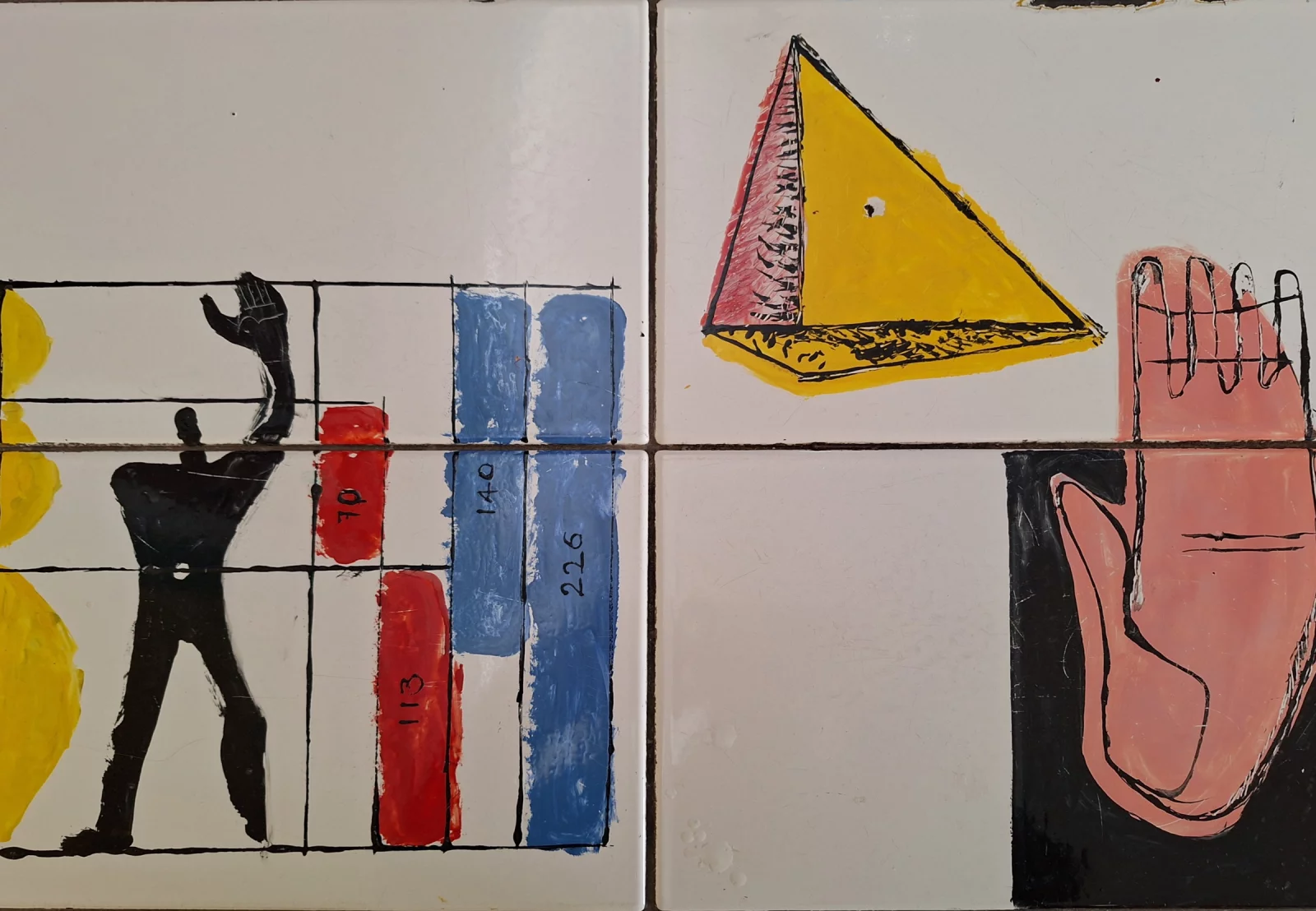
Blue is the skeleton. Red is the breath.
The division of labour
The Modulor consists of two series, and we take that division of labour literally.
The red series is the human measure: everything you read and touch. Type sizes, line height, the space between a heading and its paragraph. Fixed values in pixels — because the distance from your eye to the screen doesn't scale with screen width.
The blue series is the architectural measure: one column width as the unit, which does scale. Section heights, image formats and the white space between blocks all rest on it. Like a structural bay: the building gets wider, the bay stays a bay.
Blue is the skeleton, red is the breath.
Key numbers
Free composition — as long as it snaps to the grid
Every measure comes from the same two series. The heading breathes on the red series, the columns carry on the blue. Nothing is arbitrary — yet it never feels rigid or dull. That is the point: structure that grants freedom.
The Modulor is a measuring system based on the human scale, applicable to architecture and mechanics.
Le Corbusier · 1948
Golden ratio
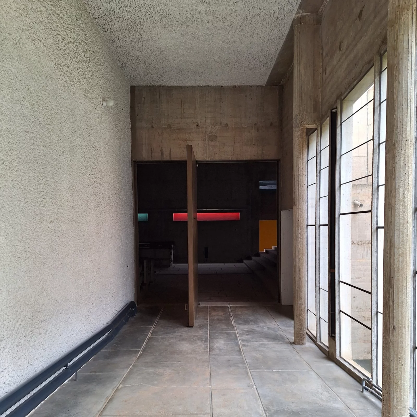
Where it comes from
Iannis Xenakis had been composing since he was sixteen when he joined Le Corbusier's atelier as an engineer in 1947. That double career is in the west façade of La Tourette: he drew the glazing as a score — unequal intervals, subdivided by the Modulor, that together still form one rhythm. That is exactly what a good page does — regularity without repetition.
We look to architecture because that discipline has millennia of head start on ours with the same question: how do you divide a surface so that it works before anyone can explain why.
The origin of our lines
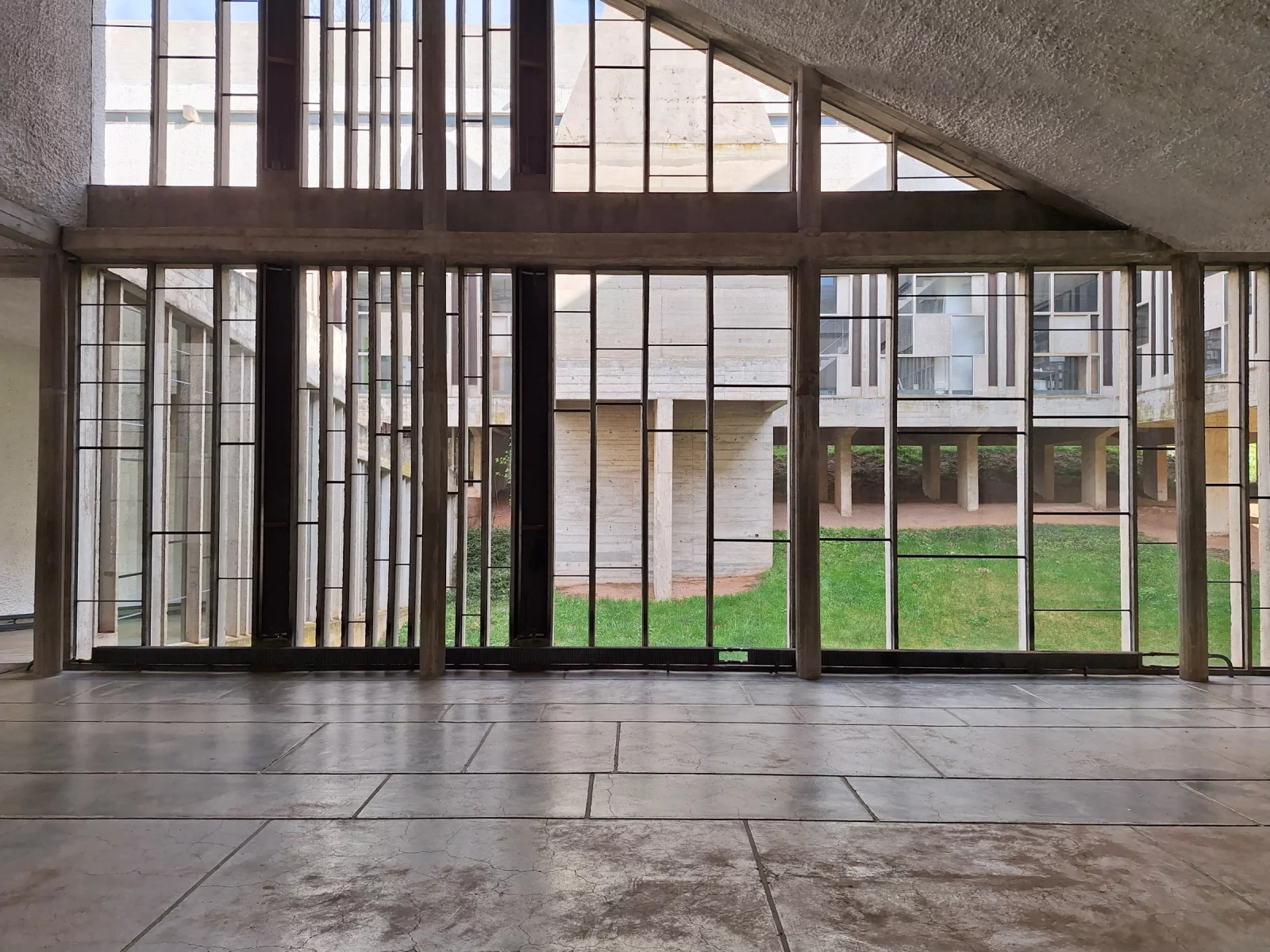
Xenakis's rhythm for La Tourette — vertical lines on the blue series.
Where to use what
Red series
px
8 · 13 · 21 · 34 · 55 · 89 · 144
- Font size & line-height
- Letter-spacing
- Padding within components
- Space between text and heading
Blue series
var(--col)
12 kolommen · φ-split
- 12-column grid
- Section whitespace (macro)
- Photo heights & offsets
- Hero height
- Breaking & negative margins
The measure is a choice, not a law
The Modulor isn't sacred, and Le Corbusier didn't treat it that way either: he started with a figure of 1.75 metres — the French average height — and later replaced it with 1.83. That figure's navel sits at 1.13 metres, and 1.83 divided by 1.13 is 1.619. There is the golden ratio, measured on a body.
The idea that one "ideal" male body should serve as the measure for everyone is precisely the part we don't adopt. That criticism is fair, and after his death architects freed themselves from it for good reason.
What remains are the proportions. They belong neither to Le Corbusier nor to us: 1.618 works because the eye recognises it, not because someone agreed on it. We borrow the series, not the anthropology.
The measure as a room
A Dominican's cell, La Tourette convent — drawn to scale. All three dimensions are Modulor terms: 1.83 = 113 × φ (red series) · 2.26 = 2 × 113 (blue series) · 5.92 = 226 × φ² (blue series). One man wide, one raised arm high.
Same measure, its own plan
This is a measuring instrument: it fixes the dimensions and leaves the form free.
What stays fixed is the system of measurement: the grid, the two series, the leading formula, the way colours and components are built. What emerges per project is the composition — which sections there are, in what order, how the page opens, where the image sits and where the text begins.
What that buys is room to move. One site opens full-width with a building; the next starts with a column of text and shows the image only after that; a third has no opening image at all and begins straight with an index. All three hold up, and for the same reason: they stand on the same measurements.
An architect works no differently. Fixed stair risers, fixed door widths, a structural grid on every drawing — and a different floor plan every time. That the measurements are fixed is not what limits the freedom; it is what makes it possible.
Three sites, one structural grid
The same twelve columns, three different buildings. What is fixed is the measure; the arrangement is designed anew each time. Blue is image, red is text — the series they come from.
What it gives you
In practice this means there are no loose numbers in a Major Tom site. Every margin, every type size and every column width comes from one of these two series. A new page inherits the system instead of starting over — so it keeps working when the content changes, even when we're not around.
What changes per project is the composition of the page — and on top of that the skin: the typography, the accent colour, the tone of the headings. The same structural grid, a different building.
Major Tom is a digital studio in Ghent. We build every site on this foundation, because a system that holds up is cheaper to maintain than a design that has to be reinvented each time.
No noise, only rhythm.